Monday, January 6, 2020

1-3-20
Updated Monthly

Secular Market Top - Since January 2000

+149.1% Dow       
+266.5% Transports 
+206.6% Utilities

+120.2%  S&P 500
+121.7%  Nasdaq

+65.4%  30yr Treasury Bond

+436.0% Gold
+146.3% Oil
  +62.9% Swiss Franc's
    
From High to Low - Since Year 2000

+436.0% Gold
+266.5% Transports
+206.6% Utilities
+149.1% Dow
+146.3% Oil 
+121.7% Nasdaq
+120.2S&P 500
+  65.4% 30yr Treasury Bonds
+  62.9% Swiss Franc's

December 1999 Shiller PE10 was 44.19               
August 2000 S&P 500 dividend yield was 1.11%  

Shiller PE10 1-3-20 is 31.02
S&P 500 dividend yield 1-3-20 is 1.77%
[Shiller PE10 & dividend yield is reported using data from the beginning of the month when I update.  It may or may not exactly be the first day.]

It is easily seen in the year 2000 the Nasdaq was horribly overvalued and gold was on the give away table, such lopsided returns 19 years later!

Also of interest the stodgy 30 year Treasury bond since the year 2000 outperformed the Dow, S&P 500 and Nasdaq until the Trump rally.  With valuations stretched to these lofty levels a value player such as DYI will once again place his monies in 30 year T-bonds or long term high quality corporate bonds out performing stocks over the next 10 to 15 years.  Please note due to the Fed's sub atomic low interest rates 30 year T-bonds or high quality long term corporate bonds will highly likely out perform stocks over the next 10 to 15 years with one big caveat; out performance will be losing far less money than stocks! Ouch!          

Saturday, January 4, 2020

Bond
Bull Market Ended? 
Image result for 10 year treasury yields since 1790 chart pictures

Supposedly “risk free” assets 

are looking awfully risky

Looking at the financial landscape today, there are some signs of trouble: the stock market keeps going up, venture capital may also be over-valued, and firms are highly leveraged. But if one asset class stands out for its high prices and potential systemic risk, it’s supposedly low-risk bonds issued by governments in the US and Europe. 
These bonds, in the lingo, are considered “risk-free.” By definition, then, they shouldn’t be risky. But prices for these assets have gotten very expensive. If their prices fall, meaning that yields rise, borrowers used to a long period of benign conditions will struggle to refinance their debts. And since many investors don’t hold bonds to maturity, the price of the asset matters more than the regular income payments it provides. 
The Bank of International Settlements and Morgan Stanley’s Ruchir Sharma worry that low rates make it easier for companies that should go out of business to get loans and continue to operate. These so-called “zombie” companies may not sound so harmful, but too many of them can cause instability over time. If yields go up, many of these firms will suddenly go out of business at the same time and displace many workers. In the meantime, they also keep people in unproductive jobs and divert capital from more productive investments. 
Odds are that eventually the risk-free rate will increase and it may be a gradual unwinding. Asian countries are slowly offering a viable alternative to Western assets and expanding the market for safe debt. Or, investors might rediscover their appetite for risk, reducing demand for safe assets. One way or another, rates will go back up some day. Until then, there is a high price to pay for removing risk from your portfolio.
 Image result for 10 year treasury yields since 1790 chart pictures
As of 1/2/20
1.88%

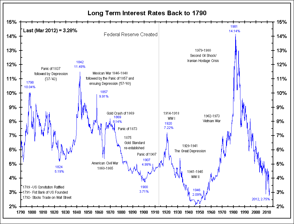
  • 1790-1902: erratic yield fluctuations and then a sustained decline in yields to below 3%.
  • 1902-1920: the First Bear Bond Market, yields rise from 3% to 5-6%.
  • 1920-1946: the Great Bull Bond Market, yields decline from 5-6% to below 2%.
  • 1946-1981: the Second Bear Bond Market, yields soar from 2% to above 15% during 1981.
  • 1981-2016: the Greatest Bull Bond Market, as yields tumble from 15% to 1.37% in 2016.
Alas, history never ends and, as I mentioned at the beginning of this essay, all empires carry inside themselves the seeds of their own destruction. Just a few decades have passed from the time when Fukuyama had claimed the end of history and the Pax Americana seems to be already over. The Western world dominance had been based first on coal, then on oil, now trying to switch to gas, but all these are finite resources becoming more and more expensive to produce. Just like Rome had followed the decline of its gold mines, the West is following follow the decline of the wells it controls. 
The dollar is losing its role of world currency and the Empire is under threat by a new commercial system. Just as the ancient silk road was a factor in the collapse of the Roman Empire, the nascent "road and belt initiative" that will connect Eurasia as a single commercial region may give the final blow to the Globalized dominance of the West. 
DYI:  The Silk Road that China and other countries are building out to enhance trade between them selves thereby over the long haul move away from the American dollar.  This grinding affair is taking place worldwide not just countries within the sphere of influence of China and Russia.  It would be logical to expect as America’s global currency free ride begins its demise will lift interest rates in a saw tooth manner higher.  This is why Presidents since Bush Jr. until today are placing sanctions on countries in an attempt to stop or at least slow down the demise of the American Empire [and the almighty buck].
 Image result for modern silk road map pictures  
To be sure, the Western Empire, although in its death throes, is not dead yet. It still has its wondrous propaganda machine working. The great machine has even been able to convince most people that the empire doesn't actually exist, that everything they see being done to them is done for their good and that foreigners are starved and bombed with the best of good intentions.
DYI:  Today's national main stream press is nothing more than the propaganda arm of the American government.  Simply go to 153news.net [videos] or Miles Mathis updates [written format] between those two will highlight America’s massive propaganda machine. 
 It is a remarkable feat that reminds something that a European poet, Baudelaire, said long ago: "the Devil's best trick consists in letting you believe he doesn't exist." It is typical of all structures to turn nasty during their decline, it happens even to human beings. So, we may be living in an "Empire of Lies" that's destroying itself by trying to build its own reality. Except that the real reality always wins.
On the other hand, it would be difficult to maintain that Westerners are more evil than people belonging to other cultures. If history tells us something, it is that people tend to become evil when they have a chance to do so. The West created many good things, from polyphonic music to modern science and, during this last phase of its history, it is leading the struggle to keep the Earth alive -- a girl such as Greta Thunberg is a typical example of the "good West" as opposed to the "evil West." 
DYI:  Greta Thunberg is one of the worst “crises actors” to come along pumping out their endless claptrap climate scare all for the purpose to raid numerous countries treasuries.
Overall, all empires in history are more or less the same. They are like waves crashing on a beach: some are large, some small, some do damage, some just leave traces on the sand. The Western Empire did more damage than others because it was larger, but it was not different. We have to accept that the universe works in a certain way: never smoothly, always going up and down and, often, going through abrupt collapses, as the ancient Roman philosopher Lucius Seneca had noted long ago. Being the current empire so large, the transition to whatever will come after us needs to be more abrupt and more dramatic than anything seen in history before. But, just like it was the case for ancient Rome, the future may well be a gentler and saner age than the current one. And the universe will go on as it has always done.
DYI:  The bond market rally of a lifetime is essentially finished.  With an upcoming recession that I'm anticipating will be relatively mild with rates moving lower with the 30 year T-bond possibly breaking below two percent.  Be as that may be DYI is holding with zero percentage in long term bonds as we are in uncharted historical waters.  Rates one day will begin their movement upwards unfortunately no one knows when that will happen.
Updated Monthly

AGGRESSIVE PORTFOLIO - ACTIVE ALLOCATION - 1/1/20

Active Allocation Bands (excluding cash) 0% to 50%
50% - Cash -Short Term Bond Index - VBIRX
50% -Gold- Global Capital Cycles Fund - VGPMX **
 0% -Lt. Bonds- Long Term Bond Index - VBLTX
 0% -Stocks- Total Stock Market Index - VTSAX
[See Disclaimer]
** Vanguard's Global Capital Cycles Fund maintains 25%+ in precious metal equities the remainder are companies they believe will perform well during times of world wide stress or economic declines.  

 This blog site is not a registered financial advisor, broker or securities dealer and The Dividend Yield Investor is not responsible for what you do with your money.
This site strives for the highest standards of accuracy; however ERRORS AND OMISSIONS ARE ACCEPTED!
The Dividend Yield Investor is a blog site for entertainment and educational purposes ONLY.
The Dividend Yield Investor shall not be held liable for any loss and/or damages from the information herein.
Use this site at your own risk.

PAST PERFORMANCE IS NO GUARANTEE OF FUTURE RESULTS.
  DYI

Thursday, January 2, 2020

Updated Monthly

AGGRESSIVE PORTFOLIO - ACTIVE ALLOCATION - 1/1/20

Active Allocation Bands (excluding cash) 0% to 50%
50% - Cash -Short Term Bond Index - VBIRX
50% -Gold- Global Capital Cycles Fund - VGPMX **
 0% -Lt. Bonds- Long Term Bond Index - VBLTX
 0% -Stocks- Total Stock Market Index - VTSAX
[See Disclaimer]
** Vanguard's Global Capital Cycles Fund maintains 25%+ in precious metal equities the remainder are companies they believe will perform well during times of world wide stress or economic declines.  

 This blog site is not a registered financial advisor, broker or securities dealer and The Dividend Yield Investor is not responsible for what you do with your money.
This site strives for the highest standards of accuracy; however ERRORS AND OMISSIONS ARE ACCEPTED!
The Dividend Yield Investor is a blog site for entertainment and educational purposes ONLY.
The Dividend Yield Investor shall not be held liable for any loss and/or damages from the information herein.
Use this site at your own risk.

PAST PERFORMANCE IS NO GUARANTEE OF FUTURE RESULTS.

%
Stock & Bonds
Allocation Formula
1-1-20
Updated Monthly

% Allocation = 100 – [100 x (Current PE10 – Avg. PE10 / 4)  /  (Avg.PE10 x 2 – Avg. PE10 / 2)]


% Stock Allocation    0% (rounded)
% Bond Allocation 100% (rounded) 

Logic behind this approach:
--As the stock market becomes more expensive, a conservative investor's stock allocation should go down. The rationale recognizes the reduced expected future returns for stocks, and the increasing risk. 
--The formula acknowledges the increased likelihood of the market falling from current levels based on historical valuation levels and regression to the mean, rather than from volatility. Many agree this is the key to value investing.  
Please note there is controversy regarding the divisor (Avg. PE10).  The average since 1881 as reported by Multpl.com is 16.70.  However, Larry Swedroe and others believe that using a revised Shiller P/E mean of 19.6 , the number since 1960 ( a 53-year period), reflects more modern accounting procedures.


DYI adheres to the long view where over time the legacy (prior 1959) values will be absorbed into the average.  Also it can be said with just as much vigor the last 25 years corporate America has been noted for accounting irregularities.  So....If you use the higher or lower number, or average them, you'll be within the guide posts of value.

Please note:  I changed the formula when the Shiller PE10 is trading at it's mean stocks and bonds will be at 50% - 50% representing Ben Graham's Defensive investor starting point; only deviating from that norm as valuations rise or fall.        
  
DYI


This blog site is not a registered financial advisor, broker or securities dealer and The Dividend Yield Investor is not responsible for what you do with your money.
This site strives for the highest standards of accuracy; however ERRORS AND OMISSIONS ARE ACCEPTED!
The Dividend Yield Investor is a blog site for entertainment and educational purposes ONLY.
The Dividend Yield Investor shall not be held liable for any loss and/or damages from the information herein.
Use this site at your own risk.

PAST PERFORMANCE IS NO GUARANTEE OF FUTURE RESULTS.

The Formula.
Margin of Safety!


Central Concept of Investment for the purchase of Common Stocks.
"The danger to investors lies in concentrating their purchases in the upper levels of the market..."

Stocks compared to bonds:
Earnings Yield Coverage Ratio - [EYC Ratio]

EYC Ratio = 1/PE10 x 100 x 1.1 / Bond Rate
1.75 plus: Safe for large lump sums & DCA
1.30 plus: Safe for DCA

1.29 or less: Mid-Point - Hold stocks and purchase bonds.

1.00 or less: Sell stocks - Purchase Bonds

Current EYC Ratio: 1.19(rounded)
As of  1-1-20
Updated Monthly

PE10 as report by Multpl.com
DCA is Dollar Cost Averaging.
Lump Sum any amount greater than yearly salary.

PE10  ..........31.10
Bond Rate...2.97%

Over a ten-year period the typical excess of stock earnings power over bond interest may aggregate 4/3 of the price paid. This figure is sufficient to provide a very real margin of safety--which, under favorable conditions, will prevent or minimize a loss......If the purchases are made at the average level of the market over a span of years, the prices paid should carry with them assurance of an adequate margin of safety.  The danger to investors lies in concentrating their purchases in the upper levels of the market.....

Common Sense Investing:
The Papers of Benjamin Graham
Benjamin Graham

Tuesday, December 31, 2019

Outperforming
Harry

A Trend Worth Considering – The Price of Gold Since 1971

Image result for gold price since 1971 chart pictures
I occasionally get comments on articles posted on the Schiff Gold Facebook page by people complaining that they’ve lost a lot of money in gold because they bought when the market was at its absolute peak in 2011 and the yellow metal nearly hit $1,900. I can certainly understand their frustration, but I don’t buy their argument that their experience proves gold is a bad investment. While eight years seems like a long time, it’s not in the big scheme of things. 
When it comes to gold, that key moment is August 15, 1971. That’s the day that Richard Nixon slammed shut the gold window and eliminated the last vestige of the gold standard. From that date, the US — and the world — has been on a pure fiat money system. Governments have taken advantage of it by inflating the money supply relentlessly. As a result, the price of gold has skyrocketed from that moment. 
Looking at it another way, the purchasing power of gold has increased dramatically since Nixon closed the gold window. When Nixon made his announcement, gold was official $35 an ounce, but the actual market price was around $45 per ounce. If you take the recent price which has been hovering between $1,450 and $1,500 per ounce, the price has increased by 3122%.
DYI: 
Let’s put that to the test and see if the numbers stack up as the author claims.  First step is to go to Average Return Calculator for gold at $45 dollars an ounce in 1971 till today at $1500.  Average annual return…drum roll please…7.42% Ok so far so good.  Next stop is Political Calculations that has historical returns for the S&P 500.  January 1971 till today…drum roll please…10.56% [dividends reinvested].  Stocks currently over this time frame are the clear winner over gold.  However as I’ve stated so many times before us mere mortals only have 20 to 30 years to put it all together for retirement.  We don’t have the luxury of almost halve a century [49 years] AND with one massive investment at day one!

Harry Browne to the rescue

Harry Browne’s Permanent Portfolio concept was ground breaking with his four uncorrelated assets – stocks, long term bonds, cash and gold – permanently maintain at 25% of the portfolio total.  The idea is winning asset(s) would outshine the losing asset(s) thus propelling the portfolio ahead all with very low downside volatility.  And by George it does work.  The Permanent Portfolio since its inception in 1983 with an average annual return of 5.96% as compared to the S&P 500 at 11.39% [capturing 48% of the S&P 500].  Despite this big difference downside volatility is at a minimum.  This makes it possible to place a large lump sum to work without fear that your timing is poor producing huge losses thus requiring years not just to break even but to move the account forward with some reasonable return.
Related image
Related image
3 fund portfolio is U.S. and international stocks plus U.S. bonds 
My problem with Harry

Despite Harry’s ground breaking advancement a forerunner of modern portfolio theory I always had a problem maintaining 25% in each asset at all times. There are times such as today with long term bonds and U.S. stocks being massively overvalued.  Why would anyone want to have 25% in bonds and another 25% in stocks?  Over a 5 to 10 period you will be generating losses.  Very easy to see over speculated markets for those who are valuation players.

Outperforming Harry


DYI’s goal is to outperform Harry’s permanent portfolio with low downside volatility and a secondary ambition of capturing ¾ [over long time periods] of the S&P 500.

DYI’s averaging formula has our model portfolio either increasing or deceasing [sometimes to zero] depending upon the historical valuation of each asset.  In my opinion DYI is well positioned to out perform the Permanent Portfolio over the next 5 years.         

Updated Monthly

AGGRESSIVE PORTFOLIO - ACTIVE ALLOCATION - 12/1/19

Active Allocation Bands (excluding cash) 0% to 50%
50% - Cash -Short Term Bond Index - VBIRX
50% -Gold- Global Capital Cycles Fund - VGPMX **
 0% -Lt. Bonds- Long Term Bond Index - VBLTX
 0% -Stocks- Total Stock Market Index - VTSAX
[See Disclaimer]
** Vanguard's Global Capital Cycles Fund maintains 25%+ in precious metal equities the remainder are companies they believe will perform well during times of world wide stress or economic declines.  

 This blog site is not a registered financial advisor, broker or securities dealer and The Dividend Yield Investor is not responsible for what you do with your money.
This site strives for the highest standards of accuracy; however ERRORS AND OMISSIONS ARE ACCEPTED!
The Dividend Yield Investor is a blog site for entertainment and educational purposes ONLY.
The Dividend Yield Investor shall not be held liable for any loss and/or damages from the information herein.
Use this site at your own risk.

PAST PERFORMANCE IS NO GUARANTEE OF FUTURE RESULTS.
DYI

lllll
                  

Monday, December 23, 2019

Bubble
News

THE GLOBAL DEBT TICKING TIME-BOMB: The Reason To Own Gold & Silver

Image result for the oil age in perspective chart pictures
As Global Debt reached a new record high of $250 trillion this year, gold and silver came briefly back on the radar for investors.  After five long years, the precious metals finally broke through key technical levels this summer.  However, after the Fed started the Repo Operations in September and the $60 billion a month of “Not-QE” in October, the focus returned once again to the Bloated Stock and Bond markets.
DYI: 
When Dr. Pavlov rang the dinner bell for his dog it has now become the same when the Fed’s ring the dinner QE bell conditioning market participants to gorge themselves on stocks and bonds.  However just as the Japanese have experienced it takes on an ever expanding money supply to maintain elevated markets.  When this ever growing bubble will burst is the unanswerable question.  There will come a time when additional QE no matter how massive will not stop a falling market.  DYI’s secular peak to trough – [this may take multiple cycles] – market drop estimation is 65% to 80%.  That level of decline will bring stocks below Shiller PE scale of ten.  Thus returning stock valuations to levels not seen since the late 1970’s!
 Image result for shiller pe ratio chart pictures
As of 12/22/19
30.88
The U.S. economy isn’t even in a recession, and the Fed is acting as if it was 2008-2009 all over again.  What happens when the U.S. economy finally rolls over??  It’s going to be terrible news, especially considering the record amount of global debt.  According to the IIF, the Institute of International Finance, global debt reached a record high of $250 trillion in the first half of the year.  However, the IIF estimates that global debt will reach $255 trillion by year end. 
In just ten years since the 2008-2009 financial crisis, the world added another $100 trillion in debt. Now, the majority of that debt went into the Stock, Bond, and Real Estate Markets.  This is precisely why the U.S. stock market has reached an all-time new high.  Unfortunately, when the U.S. and the global economy finally enters into a recession-depression, the asset values will crash while the debts remain. 
Total global debt will reach $255 trillion by the end of 2019 versus $3.4 trillion worth of gold and $90 billion in silver.  Thus, the total world gold investment holdings are only 1.3% of the outstanding global debt, while world silver investment is a measly 2.6% that of gold.
When the poop hits the fan market players will scramble for safe havens.  Their top choice that has zero counter party risk is physical gold and silver and after that will move to U.S. and Swiss Treasury bonds.
Currently, the massive Global Debt Time-Bomb isn’t impacting the values of the precious metals.  This is because the mentality driving the market isn’t considering the FUTURE ENERGY needed to pay back all this debt.  We must remember that Debt represents future obligations that can be paid back only when the global economy BURNS ENERGY.
Image result for the oil age in perspective chart pictures
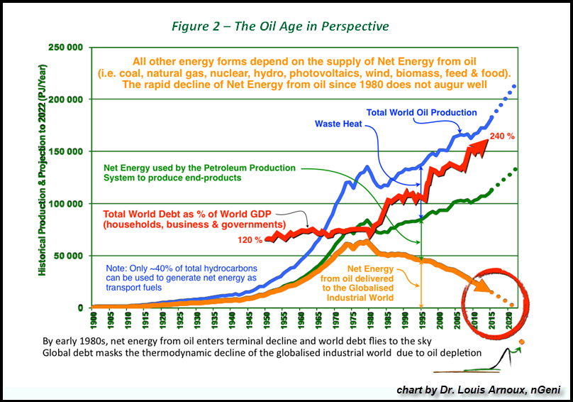
This chart is very easy to understand.  All one has to know is that as the NET ENERGY from oil delivered to the market (Orange line) has declined, the total World Debt to GDP (Red line) has increased.  The data in the chart is a bit old, but the trend continues in the same direction. Based on the total global debt reaching $255 trillion by the end of 2019 and the estimated $88 trillion in world GDP, that equals a World Debt to GDP of 290%, much higher than the 240% shown in the chart.  So, as you can see… the world continues to head towards the ENERGY CLIFF.
Simply put there is no longer enough net energy from all sources to support this level of debt.  When this is recognized by the majority on Wall Street the world wide markets will begin their declines.  Of course at the expense of being repetitive no one knows when that will happen.   

(Bloomberg Opinion) -- It’s becoming increasingly apparent that the negative interest rates introduced in several countries in the wake of the global financial crisis are trashing bank profitability. Less obvious, though perhaps more crucial for society as a whole, are their debilitating impact on pension plans. And that’s why the days of sub-zero borrowing costs may be drawing to a close. 
There’s nothing irrational, however, in fearing the economic consequences of keeping borrowing costs below zero for a sustained period of time. The emergency measures introduced to resuscitate growth, including central banks expanding their balance sheets by embarking on quantitative easing, were supposed to be transient. Instead, they’ve become fixtures of the economic firmament. 
It’s been disastrous for pension plans. A 1% decline in interest rates increases calculated pension liabilities by about 20%. It reduces the funding ratio, which measures a pension provider’s ability to meet its future commitments, by about 10%. Those estimates come from a survey of 153 European pension providers with 1.9 trillion euros ($2.1 trillion) of assets sponsored by Amundi SA, Europe’s biggest asset manager, and published by Create-Research earlier this month.
Those low returns store up trouble for the future. It’s especially worrying as responsibility for putting aside retirement cash is increasingly transferred to individuals and away from companies and governments. Danish central bank Governor Lars Rhode went so far as to call the burden unacceptable: 
“The task of bolstering the pension system to withstand pressures from lower rates and higher dependency ratios cannot be delegated to the individual pension saver,” he said earlier this month.
Image result for 10 year t-bonds yield chart pictures
As of 12/23/19
S&P 500 dividend yield 1.78%
30 year T-bond is 2.34%
10 year T-bond is 1.92%
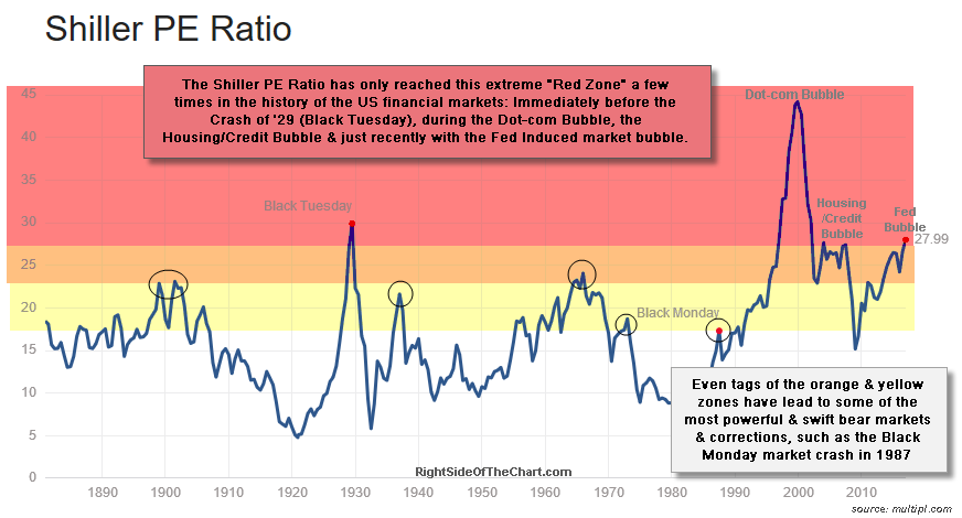
 Image result for shiller pe chart pictures
As of 12/23/19
Shiller Pe
30.88
I’ve been reporting for years how our sub atomic low yields are destroying the remainder of our old fashion pension plans.  These types of plans are primarily with our State and Local government employees that are extremely unfunded and will eventually require retirees to take on significant reduced benefits.  For those who are placed into the do it yourself category [with or without 401k’s] due to a such sub atomic low return environment individuals today would have to put away 25% of their income to foster some semblance of a retirement.  Obvious that is not in the cards for the vast majority.

Image result for dollar loss since 1913 chart pictures
With the ever present decline in the purchasing power of the American dollar [inflation] placing savers/investors behind the eight ball requiring returns greater than the government ability to debase our currency.  This is why I created my four asset category model portfolio [for in depth explanation]  that will over time react positively to any economic conditions.
 Updated Monthly

AGGRESSIVE PORTFOLIO - ACTIVE ALLOCATION - 12/1/19

Active Allocation Bands (excluding cash) 0% to 50%
50% - Cash -Short Term Bond Index - VBIRX
50% -Gold- Global Capital Cycles Fund - VGPMX **
 0% -Lt. Bonds- Long Term Bond Index - VBLTX
 0% -Stocks- Total Stock Market Index - VTSAX
[See Disclaimer]
** Vanguard's Global Capital Cycles Fund maintains 25%+ in precious metal equities the remainder are companies they believe will perform well during times of world wide stress or economic declines.  

 This blog site is not a registered financial advisor, broker or securities dealer and The Dividend Yield Investor is not responsible for what you do with your money.
This site strives for the highest standards of accuracy; however ERRORS AND OMISSIONS ARE ACCEPTED!
The Dividend Yield Investor is a blog site for entertainment and educational purposes ONLY.
The Dividend Yield Investor shall not be held liable for any loss and/or damages from the information herein.
Use this site at your own risk.

PAST PERFORMANCE IS NO GUARANTEE OF FUTURE RESULTS.
DYI

Monday, December 16, 2019

Bubble
News

Why a 60-65% Market Loss 

Would Be Run-Of-The-Mill

One might view the very comparison of present stock market conditions to 1929 market peak as exaggerated and preposterous, but then, one would be wrong. 
The fact is that on the valuation measures we find most strongly correlated with actual subsequent long-term and full-cycle market returns across history (and even in recent decades), current market valuations match or exceed those observed at the 1929 peak.
DYI:
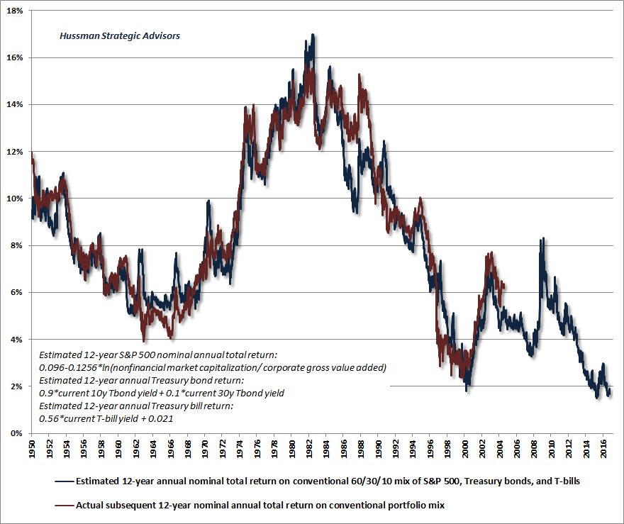
Extreme market valuations I’ve been reporting on since 2012 when stock prices reached their 1966 valuation high then take their long journey to mean invert in 1982 for a 17 year bear market!  Now we have blown past valuation markers for 1929 [see chart below] and could be on our way [who knows?] for a redo of the year 2000!

Meanwhile, given the depressed yields on long-term bonds, our estimate for 12-year total returns on a conventional asset mix (60% stocks, 30% Treasury bonds, 10% T-bills) has collapsed to just 0.8% annually [May 2019][see chart below]. 
This is lower than any point in history except a 6-week period surrounding the 1929 market top, a 3-week period surrounding the January 2018 pre-correction market peak, and a 6-week period surrounding the September 2018 pre-correction market peak.
 Image result for hussman charts pictures
December 2019
Estimated annual nominal return
0.28%
As a final note on valuations, it’s important to understand that because corporate earnings are more volatile than stock prices themselves, the price/earnings ratio of the S&P 500 is dramatically affected by the position of the economy in the economic cycle. When earnings are depressed, even very high price/earnings ratios can actually be associated with very high expected market returns. On the other hand, investors are regularly misled at bull market peaks by the fact that P/E ratios are often “well below historical extremes” at those points. The error comes in applying an elevated P/E ratio to already elevated (sometimes record) earnings. Historically, this has been a recipe for disaster.
No doubt this economy is long in the tooth an expectation of a soon to be expected recession is with warrant.  When the downturn will begin remains up in the air as my recession indicators have all receded.
Be careful not to assume that there is some reliable linear relationship between government deficits and subsequent inflation. There isn’t. Inflation has an enormous psychological component. The central point is that there is far greater risk of destabilizing public expectations about the soundness of government liabilities when deficits move well beyond the level that would be appropriate, given the position of the economy in its cycle. That’s a risk that investors seem to be wholly ignoring here. 
 Image result for pictures bloomberg is inflation dead pictures

The OPEC+ Deal Was The First Step To $100 Oil

The price of oil has been trapped in the mid-$50s because of fear: 
1) Fear that OPEC+ would break ranks and flood the global market with oil. 
2) Fear of weaker oil demand thanks to a global recession, which now looks extremely unlikely. 
3) The belief that the United States can ramp up oil production at will to meet global demand. 
Fear #1 was eliminated on December 6thNow that the OPEC Cartel members and Russia have agreed to lower their output by another 500,000 barrels of oil per day through March, oil traders can check that box and we can focus on debunking the “Fear of Recession”. 
Fear #2 remains subdued as the U.S Economy is expanding: 
“These are blowout numbers and the U.S. economy continues to be all about the jobs,” Tony Bedikian, head of global markets for Citizens Bank said in a note. “The unemployment rate is at a 50-year low and wages are increasing. Business owners may be getting more cautious due to trade and political uncertainty and growth may be slow, but consumers keep spending and the punch bowl still seems full.” 
It is impossible to believe that there will be a global recession if the world’s largest economy is this strong. With or without a trade agreement between the U.S. and China, the November jobs report should push WTI over $60/bbl. If a “Phase One” agreement is signed with China, look for WTI to move over $65/bbl within weeks. 
Fear #3 U.S. is unable to ramp up production at will: 
U.S. production growth is the annual increase in well depletion rates. More and more of our production comes from horizontal shale wells that have steep first year decline rates. After massive frac jobs, horizontal wells (some with more than two-mile laterals) come on strong, payout quickly and then decline by 50% to 70% within twelve months. It is not uncommon for a Permian Basin oil well to produce over 1,000 barrels of oil per day in the first 90 days and then decline to less than 100 barrels per day within two year. Well level economics are great, even at $55/bbl oil, but upstream companies in the shale plays must have an aggressive development drilling program to hold production flat. 
Conclusion: This world now consumes over 3 Billion barrels per month of hydrocarbon-based liquids, most of which are refined from crude oil. The oil & gas industry has a massive supply chain that most people cannot comprehend. It only takes a crude oil shortage of 1% to cause a very large price spike. All previous price spikes, including the one to $147/bbl in early 2008, caused a bidding war between refiners for the world’s important commodity –  oil.
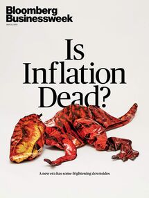
If this comes to past with oil prices at $100 plus per barrel expect a soon to arrive recession causing deflationary pressures.  Over the shorter run of two to three years out it appears that the inflationary genie remains in his bottle.  An asset smash for stocks, bonds, and to a lesser degree real estate is in the cards.  When the smash does arrive the Fed’s will print like mad men in their attempt to turn around prices.  Eventually the Fed’s will have their inflation with the unfortunate possibility of letting the genie out of the bottle with a redo of the 1970’s and 80’s.
DYI