Friday, December 13, 2019

Market
Update
DYI:

The chart below is showing you the huge secular bull market move for stocks and bonds are essentially finished.  There is a possibility of one last party for long term bonds as it is highly likely during the next recession the Fed’s will move to negative interest rates.  Be as that may be it is obvious historically long term bonds and stocks are no bargain as valuations have leaped to the heavens. 
Image result for 30 year t-bond chart pictures
Secular Trends Regression Channel
Stocks are now 125% above their mean [see chart above].  What this is telling us as a market valuation investor those holding or buying stocks now better be prepared over the coming years for massive losses.  From secular peak to secular trough a case can be made for a 60% to 85% decline due to such massive overvaluation [see chart below]. 


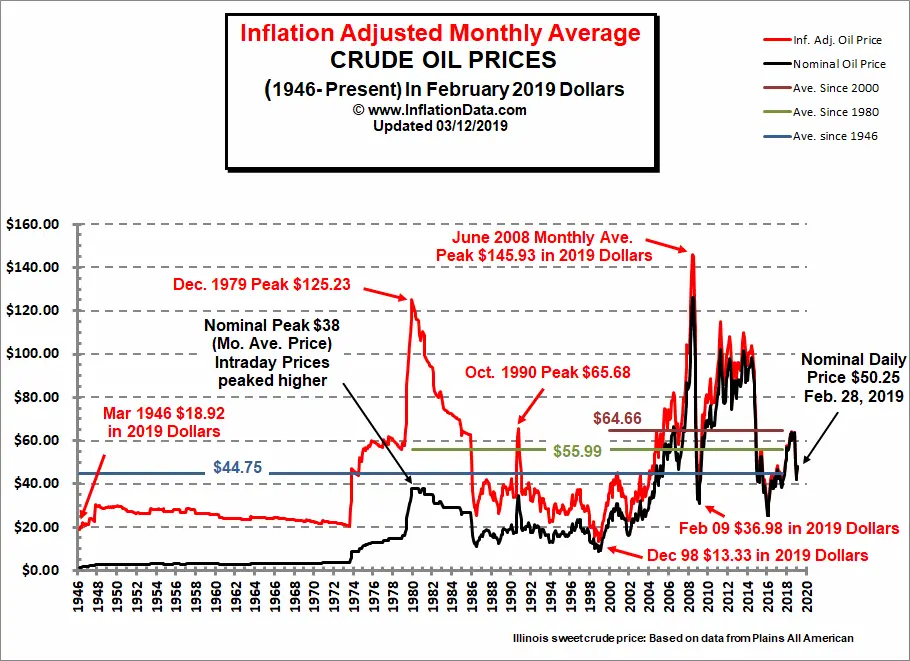
Inflation Adjusted Crude Oil Price Chart
As of 12/13/19 
$59.84
In my mind what is holding up prices are two fold; massive or should I say gargantuan Federal Reserve intervention AND reasonable energy prices.  

Oil Prices in Inflation Adjusted Terms

The major peaks occurred in December 1979 at $125.23, October 1990 at $65.68, and June 2008 at $145.93 (all inflation adjusted to 2019 dollars). Another interesting item to note is that the inflation adjusted average price has been increasing. The average for the entire period from 1946 to present is $44.75 but the average since 1980 is $55.99 and the the average since 2000 is $64.66.  This may be the result of increased extraction costs as it becomes harder to find and requires much greater technology to extract oil.
Energy prices and especially oil and its cousin gas have a huge impact on the economy with high prices acting as a tax slowing economic growth or possibly pushing into recession.  Below is my Oil Indicator.
 12/01/19
Updated Monthly
Oil Prices: 
11/27/14....  $69.86
12/01/19......$65.72   

Down 6%(rounded)
(oil prices approximately five years earlier due to weekends & holidays)
ANS West Coast prices   
 OIL INDICATOR:  Positive  Oil indicator will remain positive until it's rise is greater than 75% from five years earlier.
Oil prices are well known for their volatility in the short term, longer term due to dwindling reserves energy prices are in a secular bull market.  Technologies such as fracking will extend the life of oil fields but major new discoveries arrive at a snails pace far slower than the world's growth.  

As long as prices rise in a slow and orderly pace our economy can adjust to those changes, however if prices spike (international tensions, war etc.) high energy costs behave as a massive deflationary tax. This will send our economy tumbling down and very possibly the U.S. stock market.

If oil prices rise greater than 75% from five years earlier, investors at that time should shift their portfolio geared towards deflationary times.  This would be an oil indicator as negative.

If oil prices rise from five years earlier less than 10% or drop then the inflationary play is in effect; a positive for economic growth along with possible higher stock prices.

Where to find five year earlier oil prices?  Alaska Department of Revenue    

Oil indicator positive                
  5%  High-Yield Corporate Bonds
10%  REIT's
10%  Energy
10%  P.M.'s
65%  Small Caps
  0%  Lt. Gov't Bonds

Oil indicator negative
  5%  REIT's
10%  Energy
10%  P.M's
10%  Small Caps
65%  Lt. Gov't Bonds

Vanguard Funds

REIT's
REIT Index Admiral  VGSLX

Energy
Energy Fund  VGENX

Precious Metals (P.M.'s)
Global Capital Cycles Fund VGPMX

Small Caps
Small Cap Value Index Admiral  VSIAX

High-Yield Corporate Bonds
High-Yield Corporate Bond Fund VWEHX

Long Term Government Bonds
Long-Term Government Bond Index Admiral  VLGSX

Stocks may continue to rocket ahead however they may soon run out of gas [sorry for the pun] as low oil prices lose their effect to power the economy.  After that super high valuations will begin to feel their effect with stocks along with their respective valuation revert back to the mean.  

If oil prices where to go back up [$100+] pushing the economy into a steep recession these super high valuations will bring down stocks in a great hurry with a one to two year horrific bear market.  Anyway you look at it stocks and long term bonds are a poor investment currently for the long term investor.
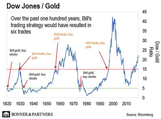
  Image result for dow/gold ratio chart pictures
All is not lost as DYI works through four asset categories.  Stocks, long term bonds, precious metals [and their respective mining shares] and short term bills/notes [cash].  Thus providing an investor with at least one asset class being in a bull market at all time. 

What I find amazing [I’m 65 years old] is how everything has gone full circle with during the 1970’s money market funds [or short term notes] were all the rage.  Today the most unloved area and thus very undervalued is money market funds or short term bills and notes.  The second best area is precious metals or their respective mining companies.  This is best shown by my sentiment indicator for my asset categories.

Market Sentiment

Smart Money buys aggressively!
Capitulation
Despondency
Max-Pessimism *Market Bottoms* Short Term Bonds
Depression MMF

Hope Gold
Relief *Market returns to Mean*

Smart Money buys the Dips!
Optimism
Media Attention
Enthusiasm

Smart Money - Sells the Rallies!
Thrill
Greed
Delusional
Max-Optimism *Market Tops* U.S. Stocks
Denial of Problem Long Term Bonds
Anxiety
Fear
Desperation

Smart Money Buys Aggressively!
Capitulation

So…This creates by using my averaging formulas DYI’s model portfolio.
 Updated Monthly

AGGRESSIVE PORTFOLIO - ACTIVE ALLOCATION - 12/1/19

Active Allocation Bands (excluding cash) 0% to 50%
50% - Cash -Short Term Bond Index - VBIRX
50% -Gold- Global Capital Cycles Fund - VGPMX **
 0% -Lt. Bonds- Long Term Bond Index - VBLTX
 0% -Stocks- Total Stock Market Index - VTSAX
[See Disclaimer]
** Vanguard's Global Capital Cycles Fund maintains 25%+ in precious metal equities the remainder are companies they believe will perform well during times of world wide stress or economic declines.  

 This blog site is not a registered financial advisor, broker or securities dealer and The Dividend Yield Investor is not responsible for what you do with your money.
This site strives for the highest standards of accuracy; however ERRORS AND OMISSIONS ARE ACCEPTED!
The Dividend Yield Investor is a blog site for entertainment and educational purposes ONLY.
The Dividend Yield Investor shall not be held liable for any loss and/or damages from the information herein.
Use this site at your own risk.

PAST PERFORMANCE IS NO GUARANTEE OF FUTURE RESULTS.
  DYI

Monday, December 9, 2019

Dismal
Returns
DYI: 
Amazing at it may seem precious metals and short term bills and notes are the best value among DYI’s four asset categories.  Long term bonds and stocks have been priced to the heavens leaving those with future returns to be dismal at best!  The charts below spell out what is ahead!

Market Sentiment

Smart Money buys aggressively!
Capitulation
Despondency
Max-Pessimism *Market Bottoms* Short Term Bonds
Depression MMF

Hope Gold
Relief *Market returns to Mean*

Smart Money buys the Dips!
Optimism
Media Attention
Enthusiasm

Smart Money - Sells the Rallies!
Thrill
Greed
Delusional
Max-Optimism *Market Tops* U.S. Stocks
Denial of Problem Long Term Bonds
Anxiety
Fear
Desperation

Smart Money Buys Aggressively!
Capitulation
For more than a year, I’ve been strongly encouraging readers to consider buying gold. 
Over the last 12 months, the price of gold is up 21.1%, handily outperforming everything from the S&P 500 index in the US to stock markets in China, Europe, and Canada, plus bonds, real estate, and even major commodities like oil. 
The real demand that’s worth watching comes from foreign governments and central banks– institutions with such a heavy appetite that they buy gold by the metric ton. 
And according to freshly-minted international banking regulations, gold is now considered to be a “zero-risk asset” for central banks and large financial institutions. 
This is important– because a number of central banks and foreign governments are really looking for alternatives to diversify away from the US dollars. 
And that’s why so many countries are starting to stockpile gold instead. It’s the best alternative to US dollars, and they’re buying up as much as they can.

Image result for dow/gold ratio chart pictures


Updated Monthly

AGGRESSIVE PORTFOLIO - ACTIVE ALLOCATION - 12/1/19

Active Allocation Bands (excluding cash) 0% to 50%
50% - Cash -Short Term Bond Index - VBIRX
50% -Gold- Global Capital Cycles Fund - VGPMX **
 0% -Lt. Bonds- Long Term Bond Index - VBLTX
 0% -Stocks- Total Stock Market Index - VTSAX
[See Disclaimer]
** Vanguard's Global Capital Cycles Fund maintains 25%+ in precious metals equities the remainder are companies they believe will perform well during times of world wide stress or economic declines.  

 This blog site is not a registered financial advisor, broker or securities dealer and The Dividend Yield Investor is not responsible for what you do with your money.
This site strives for the highest standards of accuracy; however ERRORS AND OMISSIONS ARE ACCEPTED!
The Dividend Yield Investor is a blog site for entertainment and educational purposes ONLY.
The Dividend Yield Investor shall not be held liable for any loss and/or damages from the information herein.
Use this site at your own risk.

PAST PERFORMANCE IS NO GUARANTEE OF FUTURE RESULTS.
DYI

Saturday, December 7, 2019

Social
Insecurity 

Another Record Low: 

Will The U.S. Fertility Rate’s 

Collapse Ever End?

Image result for u.s. total fertility rate long term chart pictures
2018 
Total Fertility Rate
1.730
Once again, the CDC has released figures on the fertility rate in the United States. Once again, the figures show an all-time low. In May, the CDC released its provisional 2018 rates, with a total fertility rate of 1.728 births per woman. On Wednesday, the CDC released its final rate, at 1.730, a decline from 1.766 in 2017 and 1.821 in 2016. That puts it at an all-time low, slightly below its 1976 trough of 1.738.
Postponing children in a time of economic uncertainty makes sense, although a study at the Center for Retirement Research attributes the recent decline to a host of other long-term factors, including declines in religious affiliation, the increasing “opportunity cost” as the gap between men’s and women’s wages narrows, and the impact of changing immigration patterns.
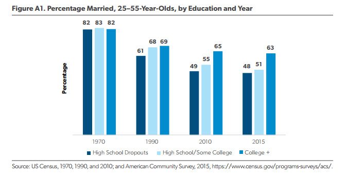
At the same time, the demographer Lyman Stone offers an alternate explanation: it’s not about childbearing in isolation but about marriage. Despite the worries about nonmarital childbearing, it is due to the postponement of marriage that Americans are having fewer children. And this isn’t merely speculation - it’s based on the math of differing fertility rates by marital status and changing marriage patterns over time.
Image result for marriage by education 25-55 year olds chart pictures

Dream-hoarding? Maybe dream-rejecting. Or, Holy Moly, would you look at these marriage statistics?!

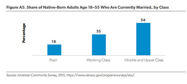
It’s now something that’s been observed repeatedly:  marriage is increasingly a middle/upper-class status.  There are all manner of explanations for this:  marriage is a poverty-avoiding tool, so unmarried people are more likely to be poor; poor people have lives which are chaotic enough that they can’t have the sort of healthy relationship that marriage requires; poor men are such screw-ups that women find the idea of marrying them no better than having another child to take care of; poor women would rather get benefits from the government than be married (but might be OK with cohabitating); etc.
12-8-2017 native born
The losses that less-educated, lower-income men “have experienced since the 1970s in job stability and real income have rendered them less ‘marriageable.’ ”   Stagnant or declining wages for middle- and working class couples impede their ability to afford a home, which is the most valuable financial asset most households own.  Couples lacking property may “have fewer reasons to avoid divorce.”
DYI: 
Having a birth rate below replacement social Security and Medicare intergenerational programs will continue to feel the financial heat with less and less young workers feeding these programs.  What will eventually happen Congress will move these programs funding from stand alone to general income taxes. Medicare will have this happen within 3 to 5 years as their trust fund will be exhausted.  This shortfall from FICA taxes will be made whole from general revenues.  The same will happen when Social Security’s trust funds run out in the year 2034.  Anyone stating these programs are going bankrupt simply doesn’t understand their funding and most important the political environment as no politician will vote against these programs.  If he or she did they would be voted out in their next election.

Marriage Class Struggle  


What I find interesting and dismaying at the same time is marriage percentage divided by class.  This social phenomena of significantly higher percentage marriage middle and upper middle class is further pressing out the boundaries between the haves and have not's.  This is especially true in the higher tier professions.  I haven’t come across any studies however today so many doctors will marry another doctor.  Back in the 1970’s or 80’s they would be billed as a “power couple.”  Today no such label occurs as this is seen as the norm.
 DYI

Tuesday, December 3, 2019

Stock Market
Oil Indicator

12/01/19
Updated Monthly
Oil Prices: 
11/27/14....  $69.86
12/01/19......$65.72   

Down 6%(rounded)
(oil prices approximately five years earlier due to weekends & holidays)
ANS West Coast prices   
 OIL INDICATOR:  Positive  Oil indicator will remain positive until it's rise is greater than 75% from five years earlier.

Oil prices are well known for their volatility in the short term, longer term due to dwindling reserves energy prices are in a secular bull market.  Technologies such as fracking will extend the life of oil fields but major new discoveries arrive at a snails pace far slower than the world's growth.  

As long as prices rise in a slow and orderly pace our economy can adjust to those changes, however if prices spike (international tensions, war etc.) high energy costs behave as a massive deflationary tax. This will send our economy tumbling down and very possibly the U.S. stock market.

If oil prices rise greater than 75% from five years earlier, investors at that time should shift their portfolio geared towards deflationary times.  This would be an oil indicator as negative.

If oil prices rise from five years earlier less than 10% or drop then the inflationary play is in effect; a positive for economic growth along with possible higher stock prices.

Where to find five year earlier oil prices?  Alaska Department of Revenue    

Oil indicator positive              
  5%  High-Yield Corporate Bonds
10%  REIT's
10%  Energy
10%  P.M.'s
65%  Small Caps
  0%  Lt. Gov't Bonds

Oil indicator negative
  5%  REIT's
10%  Energy
10%  P.M's
10%  Small Caps
65%  Lt. Gov't Bonds

Vanguard Funds

REIT's
REIT Index Admiral  VGSLX

Energy
Energy Fund  VGENX

Precious Metals (P.M.'s)
Global Capital Cycles Fund VGPMX

Small Caps
Small Cap Value Index Admiral  VSIAX

High-Yield Corporate Bonds
High-Yield Corporate Bond Fund VWEHX

Long Term Government Bonds
Long-Term Government Bond Index Admiral  VLGSX

Disclaimer

This blog site is not a registered financial advisor, broker or securities dealer and The Dividend Yield Investor is not responsible for what you do with your money.
This site strives for the highest standards of accuracy; however ERRORS AND OMISSIONS ARE ACCEPTED!
The Dividend Yield Investor is a blog site for entertainment and educational purposes ONLY.
The Dividend Yield Investor shall not be held liable for any loss and/or damages from the information herein.

Use this site at your own risk.

PAST PERFORMANCE IS NO GUARANTEE OF FUTURE RESULTS.

Monday, December 2, 2019

12-1-19
Updated Monthly

Secular Market Top - Since January 2000

+144.0% Dow       
+264.7% Transports 
+200.6% Utilities

+113.8%  S&P 500
+112.9%  Nasdaq

+66.0%  30yr Treasury Bond

+406.1% Gold
+115.5% Oil
  +57.8% Swiss Franc's
    
From High to Low - Since Year 2000

+406.1% Gold
+264.7% Transports
+200.6% Utilities
+144.0% Dow
+115.5% Oil 
+113.8% S&P 500 
+112.9% Nasdaq  
+  66.0% 30yr Treasury Bonds
+  57.8% Swiss Franc's

December 1999 Shiller PE10 was 44.19               
August 2000 S&P 500 dividend yield was 1.11%  

Shiller PE10 12-1-19 is 30.54
S&P 500 dividend yield 12-1-19 is 1.82%
[Shiller PE10 & dividend yield is reported using data from the beginning of the month when I update.  It may or may not exactly be the first day.]

It is easily seen in the year 2000 the Nasdaq was horribly overvalued and gold was on the give away table, such lopsided returns 19 years later!

Also of interest the stodgy 30 year Treasury bond since the year 2000 outperformed the Dow, S&P 500 and Nasdaq until the Trump rally.  With valuations stretched to these lofty levels a value player such as DYI will once again place his monies in 30 year T-bonds or long term high quality corporate bonds out performing stocks over the next 10 to 15 years.  Please note due to the Fed's sub atomic low interest rates 30 year T-bonds or high quality long term corporate bonds will highly likely out perform stocks over the next 10 to 15 years with one big caveat; out performance will be losing far less money than stocks! Ouch!          

The Cholesterol Myth

Study Links Statins to 300+ Adverse Health Effects

It turns out that a common sleight of hand in the medical literature is the popularization of claims around “relative risk reduction” which can make an effect appear meaningful, 
when the “absolute risk reduction” reveals its insignificance. 

In this way, 100 people are treated with statin medications to offer 1 person benefit, and the change from a 2% to a 1% heart attack rate is billed a 50% reduction rather than a 1% improvement, which is what it actually is.
Perhaps this would still qualify as better safe than sorry if these medications weren’t some of the most toxic chemicals willfully ingested, with at least 300 adverse health effects evident in the published literature so far, with at least 28 distinct modes of toxicity:

While no study has ever shown any association between the degree of cholesterol lowering and beneficial outcomes described in terms of absolute risk reduction (likely because they would be perceived as insignificant), the adverse effects are not only always presented in these terms, 
but are also minimized through the technique of splitting common side effects up into multiple different categories to minimize the apparent incidence.

Statins: Not Worth the Harm

Of course, none of these findings nor their suppression should be surprising because there is no pharmaceutical free lunch, and because Americans are so accustomed to interfacing with human health through the lens of a one pill-one ill model. We are yanking on that spider web and expecting only one thread to pull out.  This perspective would be less disturbing if it didn’t serve as the foundation for medical practice, determined by boards such as the American College of Cardiology and The American Heart Association , the majority of whom have extensive ties to the pharmaceutical industry. An industry that has paid out 19.2 billion dollars for civil and criminal charges in the last 5 years alone.
So, the next time you hear of a doctor recommending a cholesterol-lowering intervention, tell him you’ll take that 1% risk and spare yourself cancer, cognitive dysfunction, myopathy, and diabetes. And then go have a 3 egg omelette WITH the yolks.

Twenty-Seven Years of Pharmaceutical Industry Criminal and Civil Penalties: 1991 Through 2017

Public Citizen published a report that catalogues all major financial settlements and court judgments between pharmaceutical companies and federal and state governments from 1991 through 2017. The report found that drugmakers entered into 412 settlements totaling $38.6 billion in criminal and civil penalties, but that the number and size of federal and state settlements against the pharmaceutical industry remained low in 2016 and 2017, with federal criminal penalties nearly disappearing.

Conclusion
The number and size of federal and state settlements against the pharmaceutical industry remained low in 2016 and 2017, with federal criminal penalties nearly disappearing. Financial penalties continued to pale in comparison to company profits, with the $38.6 billion in penalties from 1991 through 2017 amounting to only 5% of the $711 billion in net profits made by the 11 largest global drug companies during just 10 of those 27 years (2003-2012).

To our knowledge, a parent company has never been excluded from participation in Medicare and Medicaid for illegal activities, which endanger the public health and deplete taxpayer-funded programs. 

Criminal prosecutions of executives leading companies engaged in these illegal activities have been extremely rare. Much larger penalties and successful prosecutions of company executives that oversee systemic fraud, including jail sentences if appropriate, are necessary to deter future unlawful behavior. 
Otherwise, these illegal but profitable activities will continue to be part of companies’ business model.
[It's already factored into their business model DYI.]

DYI: 
I’m having a difficult time adding anything of value to these two articles.  The U.S. and the world with its war against saturated fat and cholesterol since the 1960’s has created this run away freight train filled with statins.  The negative side effects for statin group of drugs are staggering and as far as I’m concerned cholesterol has as much to do with heart disease as EMT’s causing traffic accidents!  I’m not a health care provider of any kind and this is my opinion.  And by the way my doctor wants me on statins and I told her I’ll pass “thank you very much!”
DYI
      

Friday, November 29, 2019

Hard Money Advocates
Win in Texas

Texas Gold Bullion Depository Getting Closer to Reality; Will Allow Texans to Do Business in Gold

Last week, the Texas House unanimously passed a bill that would facilitate the establishment and operation of the Texas Bullion Depository; helping to undermine the Federal Reserve’s monopoly on money. 
The creation of a state gold depository in Texas represents a power shift away from the federal government to the state, and it provides a blueprint that could ultimately end the Fed. The facility will not only provide a secure place for individuals, business, cities, counties, government agencies, and even other countries to to store gold and other precious metals, the law also creates a mechanism to facilitate the everyday use of gold and silver in business transactions. In short, a person will be able to deposit gold or silver – and pay other people through electronic means or checks – in sound money. 
As part of the process, Rep. Giovanni Capriglione (R-Keller) introduced House Bill 3169 (HB3169) in March. The legislation includes various provisions for the operation and administration of the Texas Bullion Depository, to define the roles of depository agents, to direct the appropriation of money from depository fees, charges, penalties, and other amounts related to the depository. The bill also  includes provisions to exempt precious metals in the depository from property taxes. 
On April 20, the Investment and Financial Services Committee passed HB3169 by a 5-0 vote. It was fast-tracked to from there, and the full House passed it by a 143-0 vote on May 5. 
Once operational, private individuals and entities will be able to purchase goods and services, using assets in the vault the same way they use cash today. Exemption from taxation of precious metals stored in the vault will further facilitate the use of stored bullion as money. 
This would incentivize the use the Texas Bullion Depository. If they then start allowing checks and debit cards to be used in conjunction with the bullion accounts – likely the next step  – it would essentially create a specie- and bullion-based bank introducing currency competition with Federal Reserve notes.
DYI: 
All that is needed is for the top 5 states by population [California, Texas, Florida, New York, and Illinois] to create their bullion banks.  The smallest states by population would immediately follow suit as they would be forced to compete in the precious metals banking business.  The remaining middle sized states would fall into line not wanting to be left out.  I don’t see this ending the Fed but no doubt would put a serious dent into their monopoly.  If this becomes popular with Texans I see Florida falling in line as the remaining three states saddled with leftist Federal policies.
DYI

Thursday, November 28, 2019

%
Stock & Bonds
Allocation Formula
12-01-19
Updated Monthly

% Allocation = 100 – [100 x (Current PE10 – Avg. PE10 / 4)  /  (Avg.PE10 x 2 – Avg. PE10 / 2)]


% Stock Allocation    0% (rounded)
% Bond Allocation 100% (rounded) 

Logic behind this approach:
--As the stock market becomes more expensive, a conservative investor's stock allocation should go down. The rationale recognizes the reduced expected future returns for stocks, and the increasing risk. 
--The formula acknowledges the increased likelihood of the market falling from current levels based on historical valuation levels and regression to the mean, rather than from volatility. Many agree this is the key to value investing.  
Please note there is controversy regarding the divisor (Avg. PE10).  The average since 1881 as reported by Multpl.com is 16.70.  However, Larry Swedroe and others believe that using a revised Shiller P/E mean of 19.6 , the number since 1960 ( a 53-year period), reflects more modern accounting procedures.


DYI adheres to the long view where over time the legacy (prior 1959) values will be absorbed into the average.  Also it can be said with just as much vigor the last 25 years corporate America has been noted for accounting irregularities.  So....If you use the higher or lower number, or average them, you'll be within the guide posts of value.

Please note:  I changed the formula when the Shiller PE10 is trading at it's mean stocks and bonds will be at 50% - 50% representing Ben Graham's Defensive investor starting point; only deviating from that norm as valuations rise or fall.        
  
DYI


This blog site is not a registered financial advisor, broker or securities dealer and The Dividend Yield Investor is not responsible for what you do with your money.
This site strives for the highest standards of accuracy; however ERRORS AND OMISSIONS ARE ACCEPTED!
The Dividend Yield Investor is a blog site for entertainment and educational purposes ONLY.
The Dividend Yield Investor shall not be held liable for any loss and/or damages from the information herein.
Use this site at your own risk.

PAST PERFORMANCE IS NO GUARANTEE OF FUTURE RESULTS.

The Formula.
Margin of Safety!

Central Concept of Investment for the purchase of Common Stocks.
"The danger to investors lies in concentrating their purchases in the upper levels of the market..."

Stocks compared to bonds:
Earnings Yield Coverage Ratio - [EYC Ratio]

EYC Ratio = 1/PE10 x 100 x 1.1 / Bond Rate
1.75 plus: Safe for large lump sums & DCA
1.30 plus: Safe for DCA

1.29 or less: Mid-Point - Hold stocks and purchase bonds.

1.00 or less: Sell stocks - Purchase Bonds

Current EYC Ratio: 1.20(rounded)
As of  12-01-19
Updated Monthly

PE10 as report by Multpl.com
DCA is Dollar Cost Averaging.
Lump Sum any amount greater than yearly salary.

PE10  ..........30.67
Bond Rate...2.98%

Over a ten-year period the typical excess of stock earnings power over bond interest may aggregate 4/3 of the price paid. This figure is sufficient to provide a very real margin of safety--which, under favorable conditions, will prevent or minimize a loss......If the purchases are made at the average level of the market over a span of years, the prices paid should carry with them assurance of an adequate margin of safety.  The danger to investors lies in concentrating their purchases in the upper levels of the market.....

Common Sense Investing:
The Papers of Benjamin Graham
Benjamin Graham