Dow/Gold Ratio as of 6/17/19
19.53
When stripping out inflation and assessing gold prices in real terms, the yellow metal emerges as a solid performer with an average annual return of 5.9% between 1970 and 2018. Meanwhile, the dollar has returned a yearly average of 4.6% during that period when held in a bank account with a three-month maturity. The analysts noted that the dollar’s under-performance stems from its loss of purchasing power, which has eroded by 85% since 1970.
Shanghai Gold Price Hits 6-Year High, Move to $1700 'Will Quickly Follow' Break of $1400
GOLD PRICES held a $4 loss for the week so far in London on Thursday, trading at $1336 as Western stock markets rose and major government borrowing costs dropped further on the bond market, setting fresh all-time negative lows on German Bunds at -0.25% per annum.
With US interest rates now "going down probably to zero," Jones reckons "[Gold's] got everything going for it," not least because "after 75 years of globalization, that's suddenly stopped and reversed.
The Gold/Silver Ratio today held above 90 for a 4th session running, extending gold's strongest pricing against the gray metal since March 1993.
Gold/Silver Ratio Hits New 26-Year High
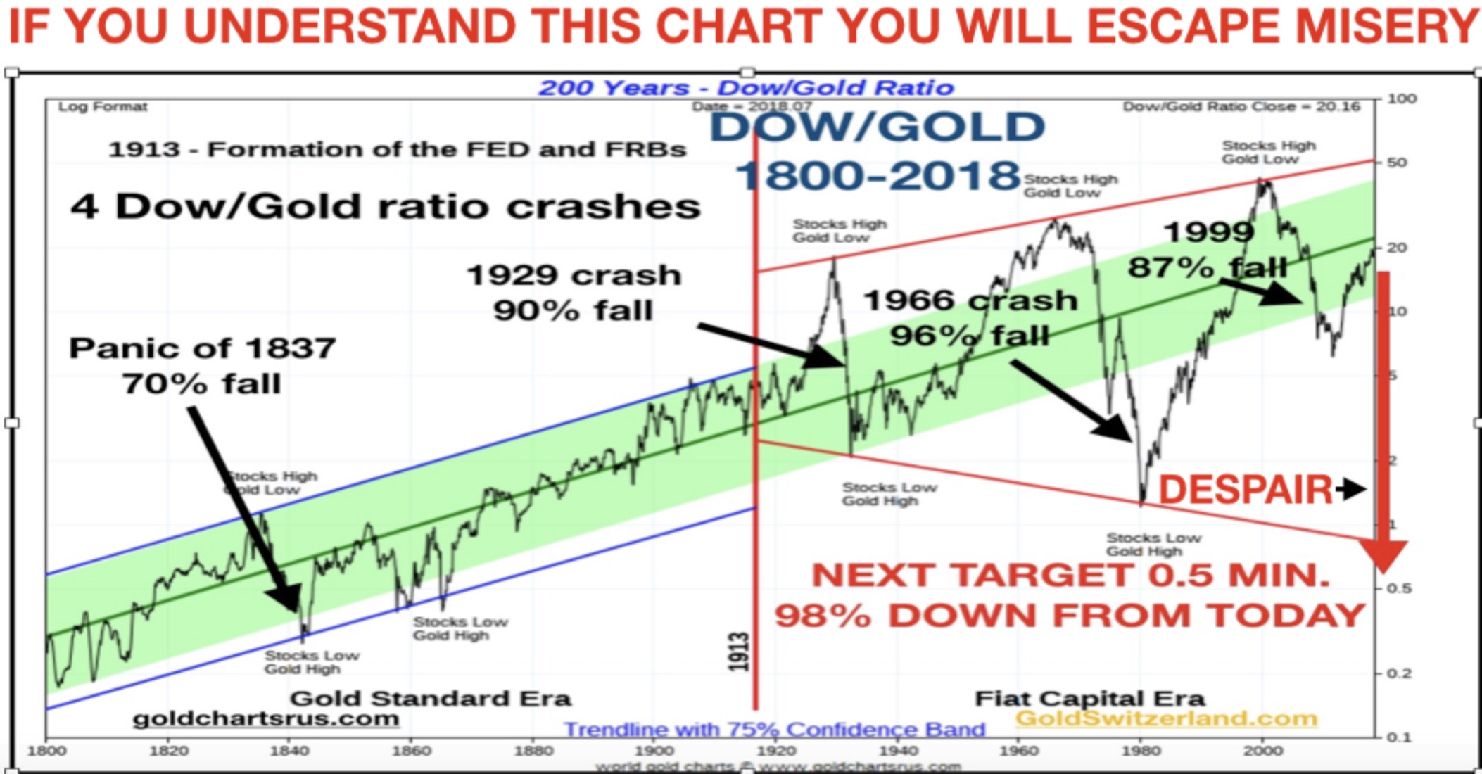
Should gold prices make substantial gains, agrees Metals Focus, "we could see the silver price start to gain from positive spillover effects...[and it may] benefit from being a far smaller, less liquid market, compared with gold." Metals Focus expect silver to start outperforming gold late in 2019, "driving the gold:silver ratio lower" into 2020.DYI: Just as the headline of the Dow/Gold Ratio chart states if you understand this chart you will escape misery is very correct. The year 2000 stocks were insanely priced with precious metals on the give-away-table plus making the mining companies – if you don’t mind the pun – dirt cheap. Back then you were catching fish out of barrel. Of course you would have been going against conventional wisdom when speaking about gold or any other precious metal or their respective mining companies. To be blunt most folks thought you had lost your mind. Didn’t you know that all of the dot.com’s or other high tech companies would be able to just mint money forever!?? In the end many would end up being dot.bombs headed for the dustbin of failed companies.
That
was then but today is now. Currently the
Dow/Gold Ratio is around its mean depending how you measure [DYI measures since
1913]. So…what we have is the obvious of
neither over or undervalued asset.
Prices could go either way this is why DYI’s averaging formula has our
model portfolio for gold at 32% and holding a massive cash horde of 68%.
Stocks
as measured by the Shiller PE is at nose bleed levels having 10 year estimated
returns at best zero or worst with loses all before REAL returns are factored.

Shiller PE as of 6/17/19
29.73
Long
term bonds – unless you are speculating on the next economic decline are of
little bargain with their sub atomic low rates.

As of 6/17/19
2.09%
I
do find his chart interesting as 10 year T-bonds remain below their 200 month
moving average. 10 year T-bonds peaked
way back in September of 1981 at 15.32% and so far on July 8, 2016 at the sub
atomic low of 1.37%. Nevertheless the
obvious bang for your buck for long bonds was back then [unless you have a time
machine] today even with mild inflation bonds on a REAL return basis is a losing
proposition. As the 200 month moving
average continues its downward plunge unless yields continue to drop eventually
they will have to go negative such as Germany or Switzerland has experienced to
keep the long term trend intact. Unfortunately
for both those who are retired are having to draw down more and more principal
to help pay those bills AND for the young person attempting to compound what
ever extra money that can be saved both are in for a frustrating time period.
DYI’s
market sentiment chart has money market funds or short term bonds as the best
bargain among stocks, long bonds, gold, or cash.
Market Sentiment
Capitulation
Have
times changed since 1980 and they will again we don’t know when but by
understanding value it is far easier to recognize when the change comes. Of course at that time you will be going
against the convention wisdom of that day with almost [except those whose know
value] everyone thinking you have lost your mind.
Till
Next Time
DYI
No comments:
Post a Comment