Thursday, March 19, 2020

Oil
Smash!
DYI:  I want to bring to your attention the huge drop in oil prices.  Since 1/6/20 West Texas Intermediate [WTI] has dropped from $63.27 and as of this morning to $22.74 for a 64% decline!  This has caused a huge bear market for oil and their related service sector companies share prices.  Using a closed end mutual fund Adams Natural Resources Fund, Inc. (PEO) as a proxy for all oil related share prices has declined from $15.48 [2/20/20] till yesterday close at $6.11 a market 61% SMASH!
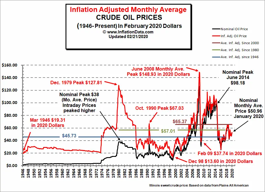
Image result for real oil price inflation data chart pictures 2020
As of 3/19/20
$22.74
How low is low?  No one knows for sure and yes WTI could very well trade in the teens.  Be as that may be the oil and gas industry is not going away anytime soon no matter what folks say about electric cars or trucks.  If the battery packs are successful it will take decades to convert all of the world wide fleets of cars or trucks to electric.  A time frame for us mortals this drop has created a buying opportunity for the long term investor.  If you are relatively young this is a great time to dollar cost average into your favorite oil/gas mutual fund. While you wait for the recovery in prices, most funds have a 4.5% or greater yield.  If you are retired, a great yield play at the onset, with a good possibility of capital gains in the future.  Please note this could very well take months in the making.  Simply put this is for the long term investors buying in during panics setting your selves up for future gains!

TILL NEXT TIME

Disclaimer


This blog site is not a registered financial advisor, broker or securities dealer and The Dividend Yield Investor is not responsible for what you do with your money.
This site strives for the highest standards of accuracy; however ERRORS AND OMISSIONS ARE ACCEPTED!
The Dividend Yield Investor is a blog site for entertainment and educational purposes ONLY.
The Dividend Yield Investor shall not be held liable for any loss and/or damages from the information herein.
Use this site at your own risk.

PAST PERFORMANCE IS NO GUARANTEE OF FUTURE RESULTS.
DYI

Tuesday, March 17, 2020

Market
Smash!
DYI:  Declining interest rates along with a 12% decline in the Dow DYI’s Earning Yield Coverage Ratio is now indicating the all clear for lump sum investing.  Again it is advised due to valuations remaining pricey defensive equities is warranted.  Such as equity income funds or utility funds come to mind.  At 22 times earnings [Shiller PE] the U.S. stock market remains a long way off from being on the give-away-table under 10 Shiller PE.  This is no time to throw caution to the wind! 

Margin of Safety!


Central Concept of Investment for the purchase of Common Stocks.
"The danger to investors lies in concentrating their purchases in the upper levels of the market..."

Stocks compared to bonds:
Earnings Yield Coverage Ratio - [EYC Ratio]

EYC Ratio = 1/PE10 x 100 x 1.1 / Bond Rate

1.75 plus: Safe for large lump sums & DCA

1.30 plus: Safe for DCA

1.29 or less: Mid-Point - Hold stocks and purchase bonds.

1.00 or less: Sell stocks - Purchase Bonds

Current EYC Ratio: 1.80(rounded)
As of  3-16-20
Updated Monthly

PE10 as report by Multpl.com
DCA is Dollar Cost Averaging.
Lump Sum any amount greater than yearly salary.

PE10  ..........22.51
Bond Rate...2.71%

Over a ten-year period the typical excess of stock earnings power over bond interest may aggregate 4/3 of the price paid. This figure is sufficient to provide a very real margin of safety--which, under favorable conditions, will prevent or minimize a loss......If the purchases are made at the average level of the market over a span of years, the prices paid should carry with them assurance of an adequate margin of safety.  The danger to investors lies in concentrating their purchases in the upper levels of the market.....

Common Sense Investing:
The Papers of Benjamin Graham
Benjamin Graham

Monday, March 16, 2020

Popping
Bubbles!
In an announcement Friday, the central bank said it was accelerating to Friday purchases it announced a day before. The move comes in response to market demand that the Fed act immediately to quell what has been an extraordinarily volatile time in the bond market, with yields sinking to historic lows amid rising liquidity concerns.

As Everything Bubble Implodes, Frazzled Fed Rolls Out Fastest Mega-Money Printer Ever, up to $4.5 Trillion in Four Weeks


Last week, the 10-year Treasury yield had plunged toward zero during the stock market sell-off, which was crazy but in line with the logic that investors were all piling into safe assets, and early Monday morning it fell to an unthinkable all-time low of 0.38%.

But then, the 10-year yield more than doubled from 0.38% at the low on Monday to 0.88% at the highpoint on Thursday. That the 10-year yield spikes during a stock market crash is somewhat of a scary thought. It means that both stocks and long-dated Treasury securities are selling off at the same time. And that probably made the Fed very nervous.

Demand for physical silver is surging and the U.S. Mint can't keep up

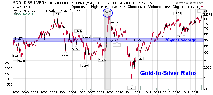
Some analysts have noted that silver is becoming more attractive to investors as its significantly undervalued compared to gold. Thursday, the gold/silver ratio hit its highest level in history at 101 [DYI blasted to 116!], meaning it takes more than 100 ounces of silver to equal one ounce in gold.
Analysts have noted that the ratio has only hit 100 a few times in history and prices are due to fall back to historical average ratio around 50 or 60 points.
%
DYI
Gold/Silver
Allocation
3-1-20

Updated Monthly

100 – [100 x (Current GS – Avg. GS / 4)
_______________________________________

(Avg.GS x 2 – Avg. GS / 2)
[The formula's answer allocates gold percentage]

Current Gold/Silver Ratio 95

Average Gold/silver Ratio 50

Allocation:    
Gold       0%
Silver  100%
Image result for gold to silver ratio chart pictures
Average Gold/Silver Ratio since 1900
50 to 1
Current Ratio as of 3/16/20
116 to 1
DYI:  The Federal Reserve – with zero reserves nor is it Federal but privately owned will resume the only two things they know to do during a downturn; electronically print money to drive down yields for Treasury securities.  This time they are going to move far more aggressively at the long end of the interest rate curve.  That is to say 10, 20 and all the way out to 30 year T-bonds yields will be pounded down way below the real rate of inflation in a vain attempt to increase loan activity hence increase economic activity. 

For those of you who own long term treasuries capital gains is a highly likely event to occur.  Silver in relation to gold is on the give-away-table.  This is telling us in an up market for precious metals over time silver will out pace the percentage gains for gold and conversely in a down market for precious metals silver’s decline will be far less severe than gold. 

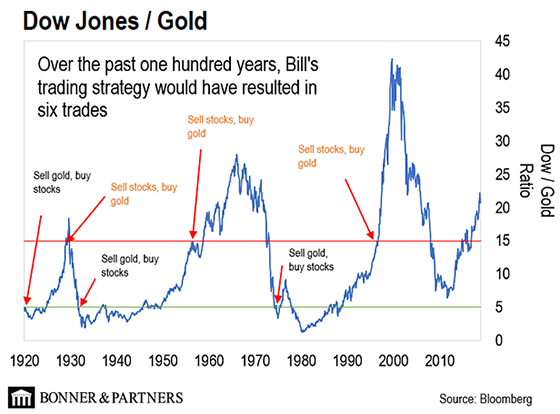
The Dow/Gold Ratio currently at 17 to 1 remains bullish for the metals as this stock market remains insanely priced!
Image result for dow/gold ratio chart pictures

TILL NEXT TIME
DYI

Saturday, March 14, 2020

POP!
GOES the MARKET!

Margin of Safety!

Central Concept of Investment for the purchase of Common Stocks.
"The danger to investors lies in concentrating their purchases in the upper levels of the market..."

Stocks compared to bonds:
Earnings Yield Coverage Ratio - [EYC Ratio]

EYC Ratio = 1/PE10 x 100 x 1.1 / Bond Rate

1.75 plus: Safe for large lump sums & DCA

1.30 plus: Safe for DCA

1.29 or less: Mid-Point - Hold stocks and purchase bonds.

1.00 or less: Sell stocks - Purchase Bonds

Current EYC Ratio: 1.65(rounded)
As of  3-14-20
Updated Monthly

PE10 as report by Multpl.com
DCA is Dollar Cost Averaging.
Lump Sum any amount greater than yearly salary.

PE10  ..........25.71
Bond Rate...2.60%

Over a ten-year period the typical excess of stock earnings power over bond interest may aggregate 4/3 of the price paid. This figure is sufficient to provide a very real margin of safety--which, under favorable conditions, will prevent or minimize a loss......If the purchases are made at the average level of the market over a span of years, the prices paid should carry with them assurance of an adequate margin of safety.  The danger to investors lies in concentrating their purchases in the upper levels of the market.....

Common Sense Investing:
The Papers of Benjamin Graham
Benjamin Graham

Friday, March 13, 2020

Image result for picture bear market
DYI:  Stock valuation, though pricey are no longer insane since they came off their peak on February 12, 2020 at 29551.42 and closed Friday at 21,200 for a whopping 28.3% decline!  
Image result for 3/12/20 stock chart
Shiller PE is back down off it lofty perch and resides at a pricey but more normal valuation of 23.54.  Compared to interest rates that are sub atomically low stocks are the better deal compared to bonds.  Be as that may be stocks are no where near the give-away-table of the late 1970’s and early 1980’s when the Shiller PE was below 10! 

Simply put as Benjamin Graham so aptly pointed out “you are no longer concentrating purchases in the upper levels of the market as this will provide a very real margin of safety, under favorable conditions, preventing or minimizing a loss.” 

Stocks are not on the give-away-table and yet are now priced favorably as compared to investment grade bonds DYI investor’s need to look into stock funds that emphasize dividends.  Vanguard’s Equity Income Fund [symbol VEIPX] comes to mind [excellent example] with its competitive yield of 3.07% as of the close on Friday 3/12/20. 


GOOD HUNTING!      


Margin of Safety!

Central Concept of Investment for the purchase of Common Stocks.
"The danger to investors lies in concentrating their purchases in the upper levels of the market..."

Stocks compared to bonds:
Earnings Yield Coverage Ratio - [EYC Ratio]

EYC Ratio = 1/PE10 x 100 x 1.1 / Bond Rate

1.75 plus: Safe for large lump sums & DCA

1.30 plus: Safe for DCA

1.29 or less: Mid-Point - Hold stocks and purchase bonds.

1.00 or less: Sell stocks - Purchase Bonds

Current EYC Ratio: 1.83(rounded)
As of  3-13-20
Updated Monthly

PE10 as report by Multpl.com
DCA is Dollar Cost Averaging.
Lump Sum any amount greater than yearly salary.

PE10  ..........23.54
Bond Rate...2.54%

Over a ten-year period the typical excess of stock earnings power over bond interest may aggregate 4/3 of the price paid. This figure is sufficient to provide a very real margin of safety--which, under favorable conditions, will prevent or minimize a loss......If the purchases are made at the average level of the market over a span of years, the prices paid should carry with them assurance of an adequate margin of safety.  The danger to investors lies in concentrating their purchases in the upper levels of the market.....

Common Sense Investing:
The Papers of Benjamin Graham
Benjamin Graham

Disclaimer


This blog site is not a registered financial advisor, broker or securities dealer and The Dividend Yield Investor is not responsible for what you do with your money.
This site strives for the highest standards of accuracy; however ERRORS AND OMISSIONS ARE ACCEPTED!
The Dividend Yield Investor is a blog site for entertainment and educational purposes ONLY.
The Dividend Yield Investor shall not be held liable for any loss and/or damages from the information herein.
Use this site at your own risk.

PAST PERFORMANCE IS NO GUARANTEE OF FUTURE RESULTS.

Thursday, March 12, 2020

Popping
Bubbles!

Dow sinks more than 2,000 points amid coronavirus uncertainty and plunging oil prices

Monday's market plunge came after OPEC talks fizzled over the weekend and Saudi Arabia slashed oil prices, triggering a price war and sending U.S. crude oil prices plunging by more than 25% -- fanning even more uncertainty among investors.

The yield on the 10-year Treasury note dropped to an unprecedented low of 0.408%, a possible signal that investors are expecting a recession.

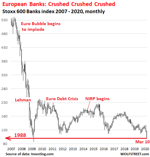
European Bank Stocks Collapse to March 2009 & 1988 Levels

But it’s even worse: The Stoxx 600 bank index has collapsed by 82% since its peak in May 2007, after having quadrupled over the preceding 12 years. It was the frenzied height of the euro bubble and the sky was supposedly the limit for Europe’s biggest banks. Things got so crazy that for a brief moment in 2008, before it all come tumbling down, the Royal Bank of Scotland, now bailed-out and majority state-owned, was the world’s biggest bank by assets.
Image result for european bank stocks get hammered chart pictures

“A Toothpick in a Tsunami”: US Big Oil Faces Bankruptcy as Prices Plunge 30% on Saudi Expansion

Image result for real oil price inflation data chart pictures 2020
As of 3/11/20
$33.07

America's housing crisis

What's gone wrong?
From cities to suburbs to rural America, the cost of housing has far outpaced increases in salaries. Home prices are growing at twice the rate of wages, and there are fewer houses on the market than in any year since 1982. The single-family house, with a garage and a front lawn, remains a bedrock of the American dream, even as it recedes from many people's reach. Young adults are one-third less likely to be homeowners than the previous generation was at the same age, and nearly two-thirds of renters say they can't afford a house. The median single-family house costs about $280,000, with demand driving prices at the lower end of the market to rise twice as fast as those of high-end homes. Once the backbone of U.S. wealth, housing has become a civic, economic, and environmental catastrophe.

Is renting any better?
It's even worse. Nearly half of renters are cost-­burdened — ­meaning they spend at least 30 percent of their income on rent. Since 1960, renters' average earnings have increased 5 percent as rents have jumped 61 percent. Eleven million Americans spend more than half of their paycheck on rent. They have little choice: After 2011, more than 4 million units renting for $800 or less per month disappeared nationwide. In trendy cities like Seattle and Austin, older, multifamily buildings are being demolished or converted into condominiums and co-ops. A minuscule percentage of new apartments are low-rent. Today, a full-time minimum-wage worker can afford a two-bedroom rental in precisely zero U.S. counties; on average, it would take clocking 127 hours a week at the federal minimum wage to make paying for one possible.

What the Fed Can Do: Print and Buy, Buy, Buy

Everyone with a pension fund or 401K invested in stocks better hope the Fed becomes the buyer of last resort, and soon.

If the stock market drops 50%, that wipes out pension funds, 401Ks, and mountains of leverage.
In other words, the Fed has to save all the asset bubbles to save the real-world economy which is now dependent on the excesses of financialization that have enriched the few at the expense of the many.
Everyone with a pension fund or 401K invested in stocks better hope the Fed becomes the buyer of last resort, and soon, as once stocks crater 50% or more, there's no way to recover the $16 trillion that evaporated, or stop the dominoes from falling.
DYI

Monday, March 9, 2020

TREASURY YIELDS
CONTINUE TO CRASH!


The yield on the benchmark U.S. 10-year Treasury briefly touched an all-time low of 0.318% in overnight trading, adding another 30 basis points to an unprecedented fall in the key interest rate. That rate was above 1.5% as recently as mid-February.

The 10-year yield, in particular, holds outsized importance in the U.S. economy for its use as a benchmark for mortgage rates and auto loans. The 30-year Treasury yield also hit a record low of 0.702%, breaching the 1% threshold for the first time in history. Bond yields fall as their prices rise.
DYI

Saturday, March 7, 2020

Treasury Yields
Crater!
10-year Yield (Log Scale)
10 year Treasury bonds now trading under 1.00%!
As of 3/6/20

0.74%!
DYI:  My sentiment indicator has changed.  Stocks moved down from Max-Optimism to Denial of Problem AND Long Term Bonds are pushed up from Denial of Problem to Max-Optimism.

Plus Money market funds from Depression to Max-Pessimism AND gold moved up from Hope to Relief.

Market Sentiment

Smart Money- Buys aggressively!
Capitulation
Despondency
Max-Pessimism Short Term Bonds & MMF
Depression

Hope
Relief *Market returns to Mean* Gold

Smart Money - Buys the Dips!
Optimism
Media Attention
Enthusiasm

Smart Money - Sells the Rallies!
Thrill
Greed
Delusional
Max-Optimism - Long Term Bonds
Denial of Problem - Stocks
Anxiety
Fear
Desperation

Smart Money - Buys Aggressively!
Capitulation

Till Next Time
DYI


Thursday, March 5, 2020

DYI:  Be very careful with the oil indicator this is due to the extreme overvalued market that remains despite the selloff. The chart below is the latest chart from dshort.com showing very clearly how insanely priced the market is based on valuations.  
****************************
************************
3/02/20
Updated Monthly
Oil Prices: 
3/2/15....  $56.02
3/2/20......$50.85   

Down 9%(rounded)
(oil prices approximately five years earlier due to weekends & holidays)
ANS West Coast prices   
 OIL INDICATOR:  Positive  Oil indicator will remain positive until it's rise is greater than 75% from five years earlier.

Oil prices are well known for their volatility in the short term, longer term due to dwindling reserves energy prices are in a secular bull market.  Technologies such as fracking will extend the life of oil fields but major new discoveries arrive at a snails pace far slower than the world's growth.  

As long as prices rise in a slow and orderly pace our economy can adjust to those changes, however if prices spike (international tensions, war etc.) high energy costs behave as a massive deflationary tax. This will send our economy tumbling down and very possibly the U.S. stock market.

If oil prices rise greater than 75% from five years earlier, investors at that time should shift their portfolio geared towards deflationary times.  This would be an oil indicator as negative.

If oil prices rise from five years earlier less than 10% or drop then the inflationary play is in effect; a positive for economic growth along with possible higher stock prices.

Where to find five year earlier oil prices?  Alaska Department of Revenue    

Oil indicator positive              
  5%  High-Yield Corporate Bonds
10%  REIT's
10%  Energy
10%  P.M.'s
65%  Small Caps
  0%  Lt. Gov't Bonds

Oil indicator negative
  5%  REIT's
10%  Energy
10%  P.M's
10%  Small Caps
65%  Lt. Gov't Bonds

Vanguard Funds

REIT's
REIT Index Admiral  VGSLX

Energy
Energy Fund  VGENX

Precious Metals (P.M.'s)
Global Capital Cycles Fund VGPMX

Small Caps
Small Cap Value Index Admiral  VSIAX

High-Yield Corporate Bonds
High-Yield Corporate Bond Fund VWEHX

Long Term Government Bonds
Long-Term Government Bond Index Admiral  VLGSX

Disclaimer

This blog site is not a registered financial advisor, broker or securities dealer and The Dividend Yield Investor is not responsible for what you do with your money.
This site strives for the highest standards of accuracy; however ERRORS AND OMISSIONS ARE ACCEPTED!
The Dividend Yield Investor is a blog site for entertainment and educational purposes ONLY.
The Dividend Yield Investor shall not be held liable for any loss and/or damages from the information herein.

Use this site at your own risk.

PAST PERFORMANCE IS NO GUARANTEE OF FUTURE RESULTS.

Tuesday, March 3, 2020

Image result for gold bars pictures

3-1-20
Updated Monthly

Secular Market Top - Since January 2000

+121.0% Dow       
+215.3% Transports 
+196.4% Utilities

+101.1%  S&P 500
+110.5%  Nasdaq

+74.2%  30yr Treasury Bond

+441.0% Gold
  +74.8% Oil
  +63.3% Swiss Franc's
    
From High to Low - Since Year 2000

+441.0% Gold
+215.3% Transports 
+196.4% Utilities 
+121.0% Dow
+110.5% Nasdaq
+101.1S&P 500
+  74.8% Oil 
+  74.2% 30yr Treasury Bonds
+  63.3% Swiss Franc's

December 1999 Shiller PE10 was 44.19               
August 2000 S&P 500 dividend yield was 1.11%  

Shiller PE10 3-2-20 is 29.34
S&P 500 dividend yield 3-2-20 is 1.88%
[Shiller PE10 & dividend yield is reported using data from the beginning of the month when I update.  It may or may not exactly be the first trading day of the month.]


DYI:  Gold since the year 2000 has blown past stocks or bonds on a NON total return basis hands down.  The nearest competitor the Dow Jones Transports at 215.3% as compared to gold at 441.0% or 105% greater!  Comparing the S&P 500 – AFTER inflation [CPI] – on a total return basis (dividends reinvested) since the year 2000 is a scant 179%. 

DYI is not a gold or silver bug site; the year 2000 the Shiller PE was trading at an astronomical 44 times earnings!  Precious metals and their mining companies were on the give-away-table from 1998 to the year 2002.  This allowed an investor 5 full years to systematically sell off stocks and load up precious metals and their mining companies.

How did I know it was time to sell off stocks in mass and buy precious metals?  The Dow/Gold Ratio was screaming massive over valuation for stocks and incredibly low valuation for precious metals.  Simple!
Image result for dow/gold ratio chart pictures
As of 3/3/20
Dow/Gold Ratio
17 to 1 
(rounded)
 DYI